Designing an Android app for E-Rickshaw drivers
Android
Fintech
2 Weeks
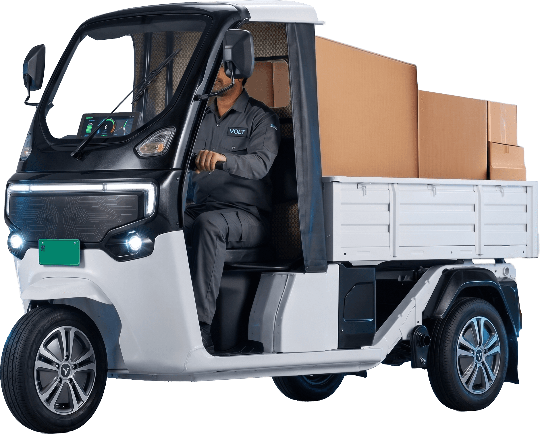
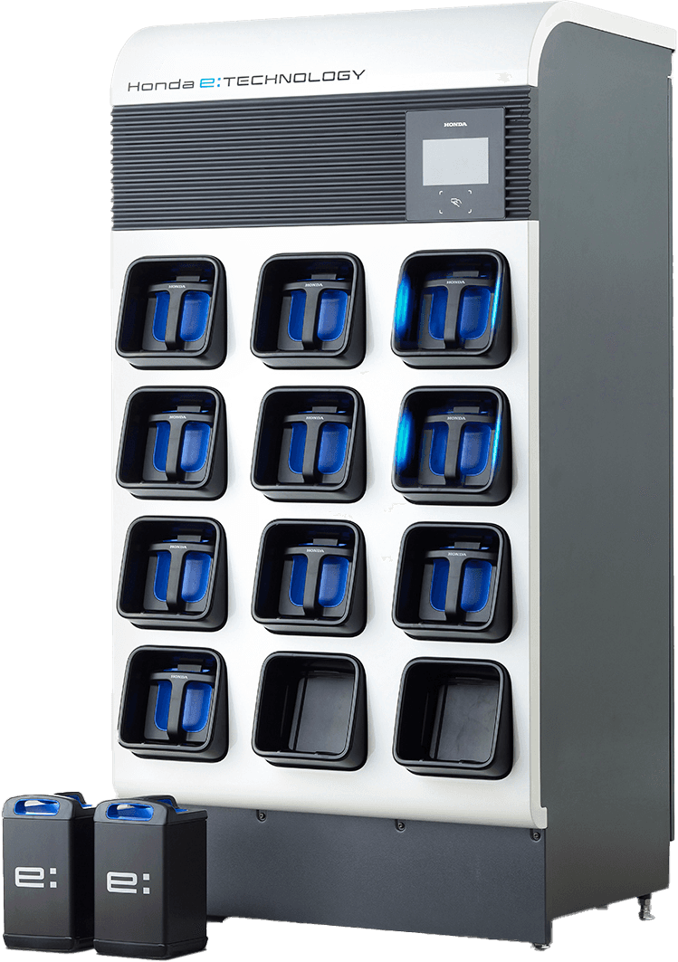
Vecmocon's fintech vertical 'Finsights' wanted to pilot a
Battery-as-a-Service offering that connected battery makers, E-Rickshaw dealers, and drivers into one financed loop with a mobile app as the driver-facing piece.
The deadline was tight. Two weeks to design and 45 days to launch mean no field research with drivers.


On top of a tight deadline, we faced several challenges that were new for us.
01
Challenges
User: E-Rickshaw Drivers
Different literacy levels, different relationship with smartphones and money than we usually design for.
02
Challenges
Language: Bilingual
Most of our work until then had been English-only.
03
Challenges
Domain: Fintech
Payments, EMIs, plan visualizations, failed-transaction states were something that our team was handling for the first team.
We adopted a simple approach
The one where we trust what our team already knows, smartly copy what already exists, and understand constraints before designing.
Use Finsights team as a research proxy
The Finsights team had been talking to dealers for months. We extracted every insight we could — driver payment habits, vehicle issues, trust signals.
Borrow patterns from apps drivers already use
For payments, we studied Paytm and other popular payment apps. Familiarity mattered more than originality.
Work alongside engineering, not before
Every feature and flow was discussed with developers from feasibility standpoint before being polished in Figma. Saved us from designing things that would have been expensive to build.
Key Insights
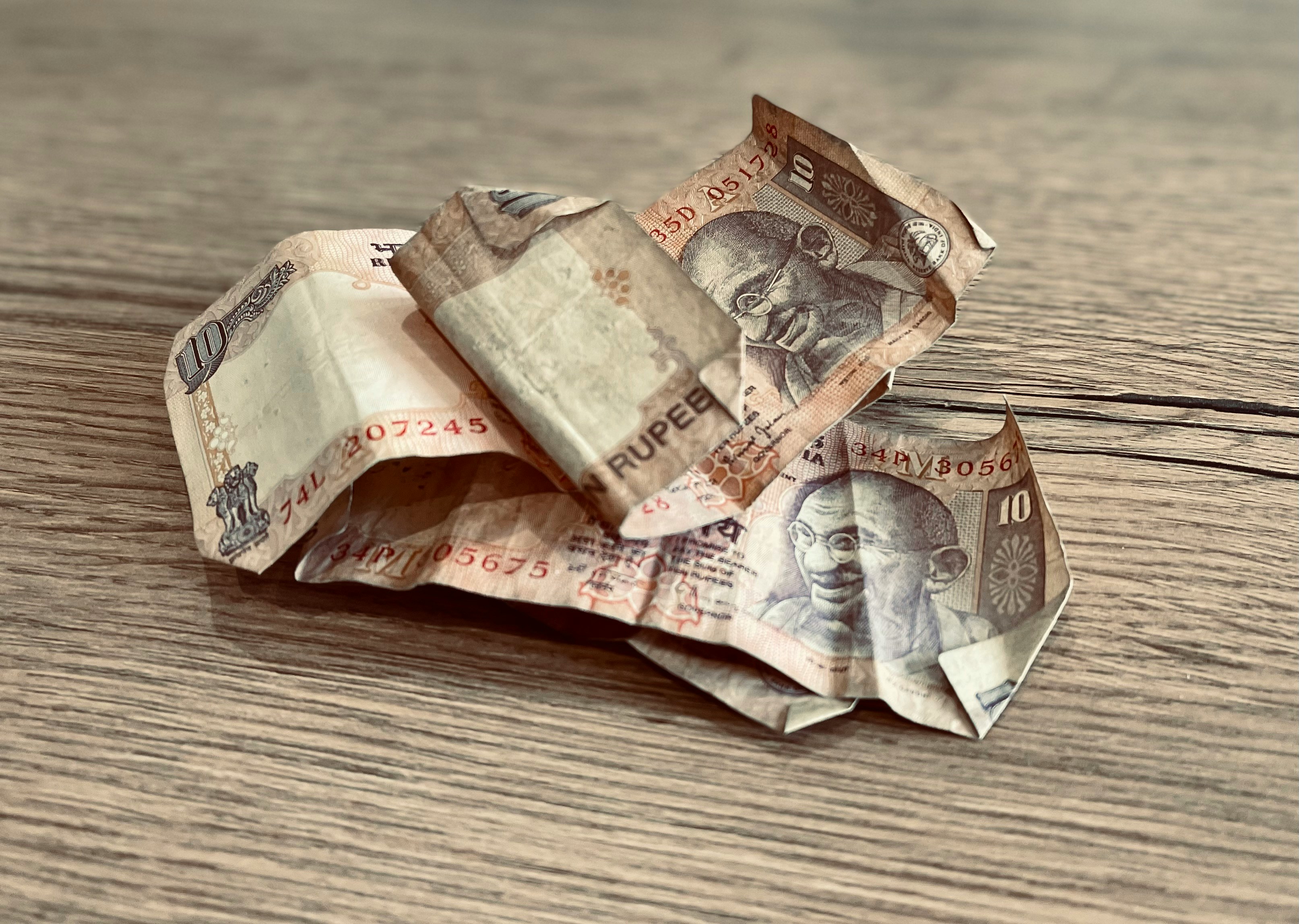
Drivers earn daily, pay daily
They don't have a salaried mental model. They'd rather chip in small amounts toward the EMI as they earn, not pay one big chunk on the first of the month. Without partial payments, many would fall behind.
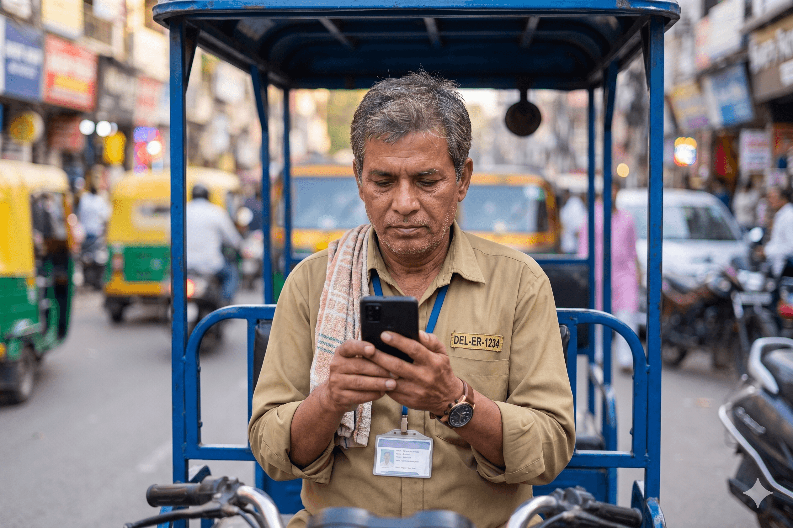
Most app opens will be problem-driven
Drivers open this app when something has gone wrong — a battery issue, a missed payment. That meant customer support needed to be one tap away, on every screen, with WhatsApp and call as first-class actions.
The dealer is the trusted face of the brand
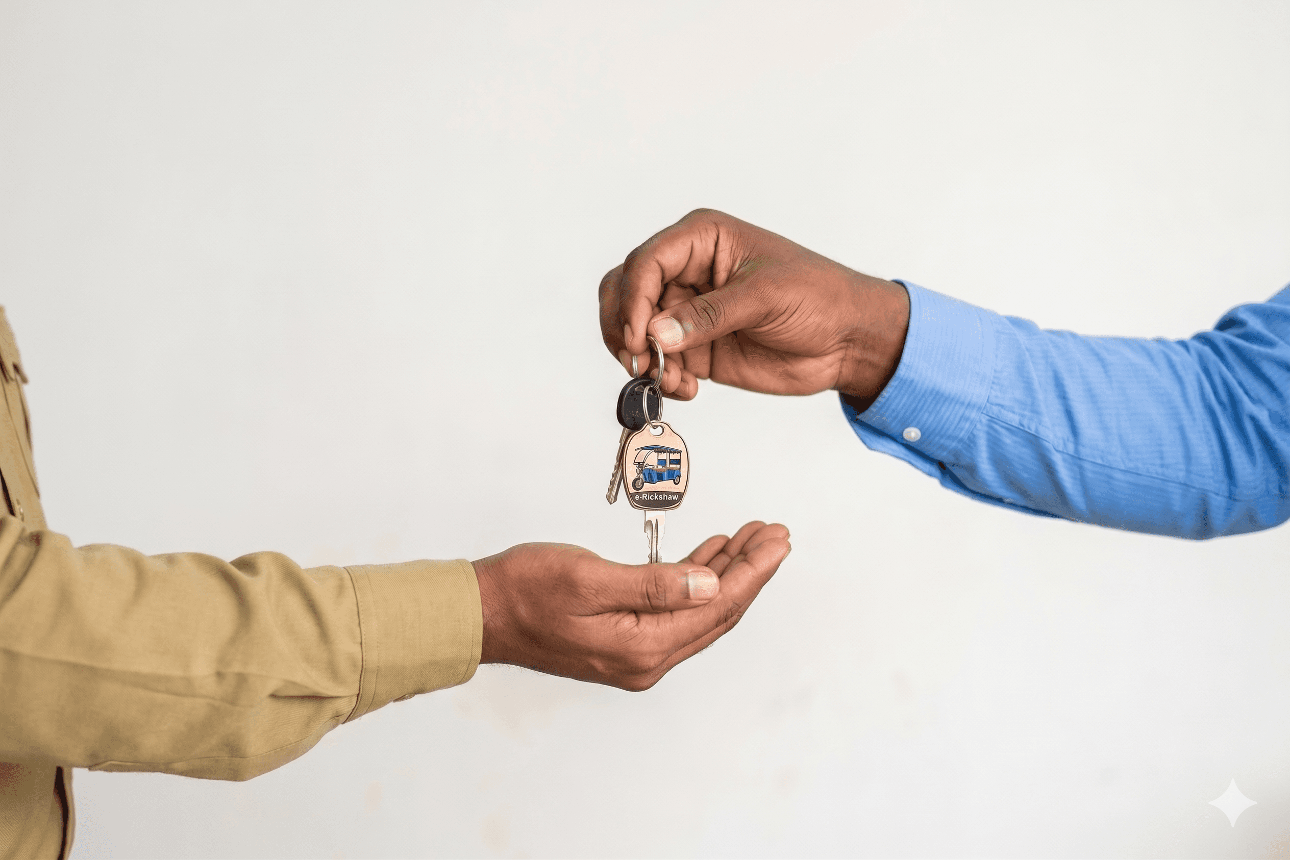
Drivers trust the dealer they bought from, not an abstract platform. The app needed to feel like an extension of that dealer relationship — which led to the swappable dealer/brand image on the home header.
The App
Language Selection on First Time Login
User selects their choice of language at the very start helping them proceed through the rest of the app with ease.
Check EMI Plan and Payment Details.
User taps on the Payments page and check all the details regarding their EMI - from down payment, total cost, EMI paid till now and the advance.
Pay EMI on-the-go daily
User can pay EMI can be paid daily by entering a custom amount. They can download or share the QR for convenience.
Check payment history for peace of mind
User can easily check past payments with clear status.
Easy to find option to resolve any issue
Schedule a service in case of vehicle issue or directly reach out to customer support for further issues.
Contextual widgets instead of notification page
Users can see what's important right now for them and take actions. Instead of building a notification page, as originally requested, we pushed back and replaced it with contextual inline alerts. One screen less to build.
Pilot outcome…till now
15 drivers onboarded. Most ended up paying in cash at the dealer.
Not because the flow was bad — it followed every best pattern we could find. But for this user, in this trust context, online payment carried a perceived risk that the dealer counter didn't. The cash counter was the trusted ritual. The app was the unfamiliar one.
A well-designed flow doesn't automatically win against an entrenched offline habit — especially when the user has limited prior trust with apps moving real money. If we'd had time for driver research up front, this is probably the insight we'd have surfaced earliest.
What I learned
Research proxies have a ceiling.
Finsights could tell us about dealers, but not about how drivers felt about online payments. That signal only comes from drivers directly.
Killing scope is a design move.
The notifications page was the cleanest example. On a fast project, what you cut matters as much as what you ship.
Shipping isn't the same as winning.
The most useful outcome of this pilot was watching drivers reach for the dealer counter instead of the QR code — and understanding why.